Redesign the Lunch Line for Healthier Habits

Today we explore cafeteria layouts and default choices that promote healthier eating, turning everyday decisions into easy, enjoyable wins. By shaping flow, sightlines, and gentle defaults, you can make nourishing options the path of least resistance. Expect practical ideas, human stories from busy lunchrooms, and simple tweaks with outsized impact. Share your cafeteria photos, questions, and experiments in the comments so we can learn together and keep improving what people see, smell, and select at mealtime.

Line Flow That Favors Produce First

Begin with abundant greens, vibrant vegetables, and whole grains where trays are first picked up. Position proteins next, and dessert or heavier items last, separated by a natural pause. This sequence harnesses momentum: diners fill plates earlier, leaving less room for impulsive extras. Keep sightlines wide so colorful salads greet eyes immediately, and anchor the line with a crisp, inviting display that feels plentiful, not punitive. Early visual appeal builds trust, curiosity, and quick yes decisions.

Default Swaps That Reduce Friction

Assume the healthiest, tastiest option unless someone asks to change it. Make water or unsweetened tea the poured beverage, whole grains the standard side, and a vegetable included without extra steps. Opt-outs remain easy, but the default removes decision fatigue during rushes. Staff scripts can reinforce this smoothly: “Today’s combo includes roasted vegetables and sparkling water—would you like to keep those?” Fewer clicks, fewer second thoughts, and a calmer line yield better choices with less effort.

Visibility and Reachability

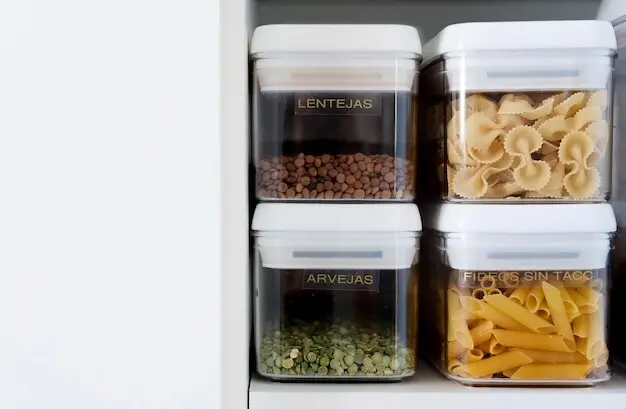
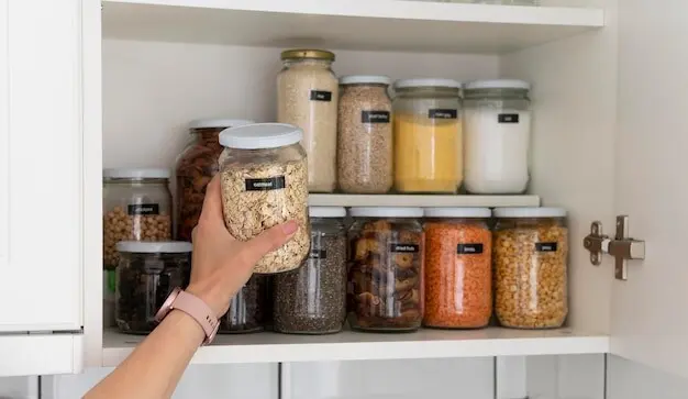
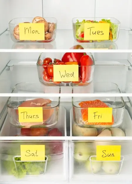
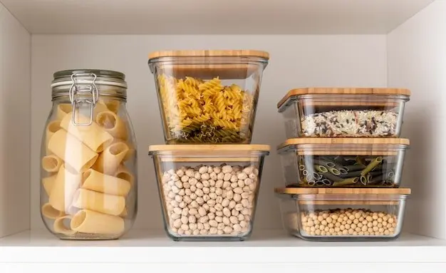
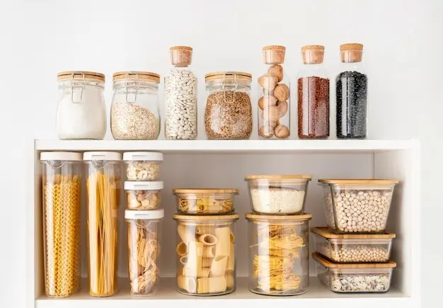
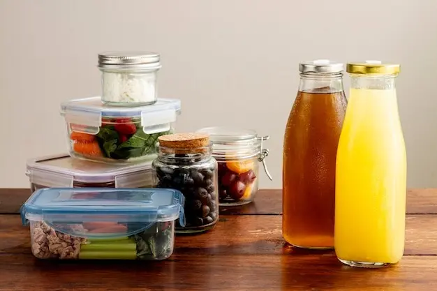
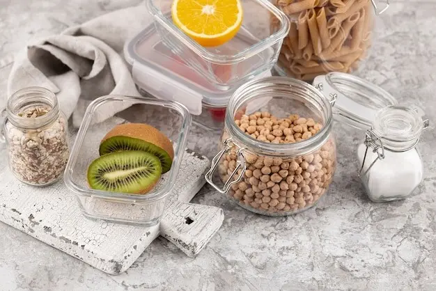
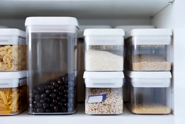
Place wholesome items at eye level and within easy arm’s reach, especially for children. Use clear containers, bright labels, and open-front displays so freshness is unmistakable. Reserve lower or harder-to-reach shelves for richer treats, still available but not constantly calling. Angle mirrors and lighting to eliminate shadows that dull leafy textures. Refill healthy favorites generously to avoid empty-pan skepticism. When good options look abundant and accessible, people trust them, grab them, and keep returning for more.

Design Details: Lighting, Color, and Scent

Environmental cues shape appetites before menus do. Light that flatters produce, colors that signal vibrancy, and careful scent control reduce competing temptations. Natural light or high-quality LEDs make fruits shine and greens sparkle with freshness. Gentle color accents guide attention without scolding. Ventilation prevents bakery aromas from overwhelming everything else. These quiet design choices support better decisions while maintaining hospitality. The space should feel like an invitation, not a lesson, where bright, honest displays carry the conversation effortlessly.

Portion Guidance and Plateware Strategy

Right-sized dinnerware, clear proportions, and intuitively sized utensils quietly calibrate servings. Smaller plates and bowls can reduce accidental overscooping, while taller glasses encourage more water with the same footprint. Clear dividers or lines on plates signal balance without rigid rules. Scoops matched to recommended portions keep queues moving and prevent second-guessing. By designing the tools of serving, you remove ambiguity, reduce waste, and help guests finish satisfied rather than stuffed, grateful for a meal that fit the moment.

Menus, Labels, and Words That Invite Better Picks

Language can unlock cravings for wholesome food. Descriptions that highlight cooking technique, origin, texture, and aroma attract attention without preachiness. Menu layouts should group nourishing options where eyes land first, supported by clear icons and readable typography. Rotating specials keep curiosity alive, while consistent defaults simplify quick choices. Avoid overload; give just enough detail to inspire. When words and layout lift up genuine flavor and craft, people choose what tastes great and happens to be better for them.

Traffic Patterns, Queues, and Time Pressure

Rushed diners default to whatever is fastest. Good layouts honor that reality by bringing quick, wholesome options to the front and reducing bottlenecks. Streamlined preorders, grab-and-go near registers, and clear wayfinding transform the noon crush into predictable rhythms. Offer seating that supports mindful bites without requiring long stays. When lines move, choices improve. Tools that reduce friction—simple shelves, labeled bins, and obvious returns—help staff and guests stay calm. Calm lines make space for curiosity, which healthier choices reward.

Equity, Inclusion, and Cultural Fit

A design that truly promotes healthy eating must fit budgets, traditions, and dietary needs. Offer variety that celebrates cultures, keep prices fair, and label allergens clearly. Invite diners and staff to co-create menus and layouts through tastings and surveys. Remove stigma from assistance programs with universal, dignified defaults. When people feel seen and respected, they engage, experiment, and share feedback. That feedback sustains momentum, ensuring the environment stays vibrant, relevant, and genuinely supportive of better daily choices.
Telifarinilo
Privacy Overview

This website uses cookies so that we can provide you with the best user experience possible. Cookie information is stored in your browser and performs functions such as recognising you when you return to our website and helping our team to understand which sections of the website you find most interesting and useful.